
A luxury AI image prompt works by specifying light, lens, materials and restraint, not by stacking adjectives like “luxury”, “expensive” and “8k”. The models that produce premium-looking results are given a photographic brief: a real camera, a real focal length, a named light source, specific materials, and an instruction to leave things out. Everything below follows that structure.
Summary
- Adjective stacking fails. “Luxury, elegant, expensive, premium, 8k, hyperrealistic” gives the model nothing to render. Camera, lens, aperture and light direction do.
- Five levers carry almost all of the effect: light quality, focal length, material specificity, negative space, and deliberate imperfection.
- Restraint reads as expensive. Cluttered frames read as stock. Name what is in the frame and cap it at three or four objects.
- Film grain and real skin texture are what separate a premium editorial look from the plastic AI look. Ask for pores, asymmetry and grain explicitly.
- Do not name real brands in prompts. You get mangled fake badges, and you inherit a trademark problem. Describe the object instead.
- Every prompt below is copy-paste ready and was used to generate the images in this article.
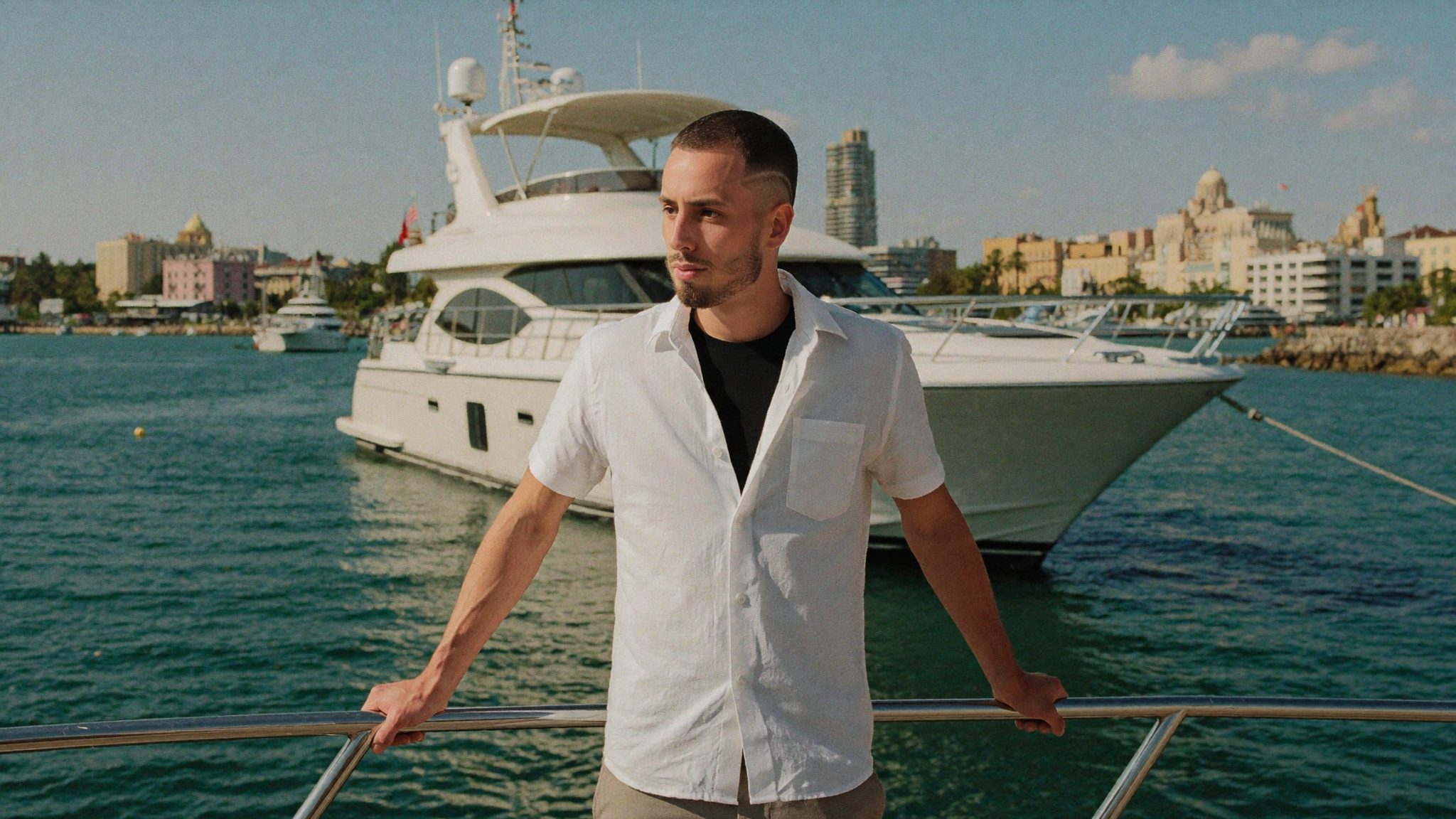
Table of Contents
- What actually makes an AI image read as luxury?
- The luxury prompt formula
- The prompt library
- Negative prompts: what to leave out
- Common mistakes
- Trademarks, disclosure and where this crosses a line
- Frequently asked questions
What actually makes an AI image read as luxury?
Five variables do nearly all the work. None of them is the word “luxury”. Every prompt in this article is built by filling in these five slots, and if a generation looks cheap, one of them is missing.
1. Light quality and direction
Premium photography almost never uses flat frontal light. It uses a single directional source with a long falloff into shadow. Name the source and where it comes from: “single soft window light from the left with a deep falloff into shadow”, “warm raking sunlight at golden hour”, “bright overcast Mediterranean light with gentle contrast”. Vague light produces vague images.
2. Camera and focal length
Naming a camera body, a focal length and an aperture changes compression, depth of field and perspective in a way that adjectives cannot. A 35mm at f2.8 gives environmental context. An 85mm at f2 isolates a subject and flattens features flatteringly. A 120mm macro at f8 is the catalogue product look. Pick one deliberately rather than letting the model guess.
3. Material specificity
“Nice furniture” is nothing. “Low travertine coffee table, boucle armchair, wide plank oak floor” is a render instruction. Luxury is communicated through named materials: travertine, brushed steel, raw linen, grained leather, teak, unlacquered brass. Swap three generic nouns for three specific materials and the same prompt jumps a tier.
4. Negative space and object count
The fastest way to make an image look like stock is to fill it. Expensive imagery is sparse. State the object count out loud: “one ceramic vase with dried branches”, “two empty teak loungers”, “deliberately sparse and uncluttered”, “generous negative space”. Models will happily add clutter if you do not forbid it.
5. Deliberate imperfection
This is the one most people skip, and it is the difference between editorial and obviously synthetic. Ask for film grain, real skin texture with visible pores and asymmetry, and explicitly forbid beautification. Perfect skin, perfect symmetry and zero grain are the fingerprints of AI. A Kodak Vision3 grade with fine grain costs you nothing and buys enormous credibility.
The luxury prompt formula
Every prompt below follows the same eight-slot order. Keep the order consistent and you can swap any single slot without the rest of the image falling apart, which is what makes this usable as a system rather than a lucky roll.
| Slot | Purpose | Example |
|---|---|---|
| 1. Image type | Sets the genre and rendering style | Photorealistic editorial lifestyle photograph |
| 2. Subject | Who or what, described physically | A man with a short buzz cut and a well-groomed short dark beard |
| 3. Wardrobe or materials | Named fabrics and finishes, not adjectives | An open white linen shirt over a black tee |
| 4. Action | What is happening, ideally mid-motion | Standing at the stern rail, looking off camera |
| 5. Location | Specific place plus one distinguishing detail | A motor yacht moored off Miami, pastel art deco skyline behind |
| 6. Light | Source, direction, time of day | Late afternoon sun with warm rim light on his shoulders |
| 7. Camera | Body, focal length, aperture | Shot on ARRI Alexa 35 with an 85mm lens at f2 |
| 8. Grade and negatives | Film stock, grain, texture, exclusions | Kodak Vision3 grading, fine film grain, real skin texture, no text, no logos |
One practical note on consistency. If you need the same person across every image, a text description will not hold them together, because faces drift between generations. That requires a trained likeness model rather than a prompt. Slots 3 through 8 stay exactly as written; only slot 2 changes.
The prompt library
Copy these directly. Replace the bracketed sections. Each was run to produce the images in this article, so what you see is what the prompt returns, not a curated best-of-fifty.
Marine and coastal
Best for founder portraits, travel brands and hospitality. The 85mm at f2 is doing the heavy lifting here: it separates the subject from a busy marina background without needing a plain backdrop.
Photorealistic editorial lifestyle photograph, [SUBJECT], wearing an open white linen shirt over a black tee and light tailored shorts, standing at the stern rail of a large white motor yacht moored off [CITY], turquoise water and pastel skyline softly out of focus behind, late afternoon sun with warm rim light on the shoulders, candid unposed moment looking off camera, shot on ARRI Alexa 35 with an 85mm lens at f2, shallow depth of field, Kodak Vision3 grading with fine film grain, real skin texture with pores and asymmetry, never beautified or smoothed, warm natural color, no text, no logos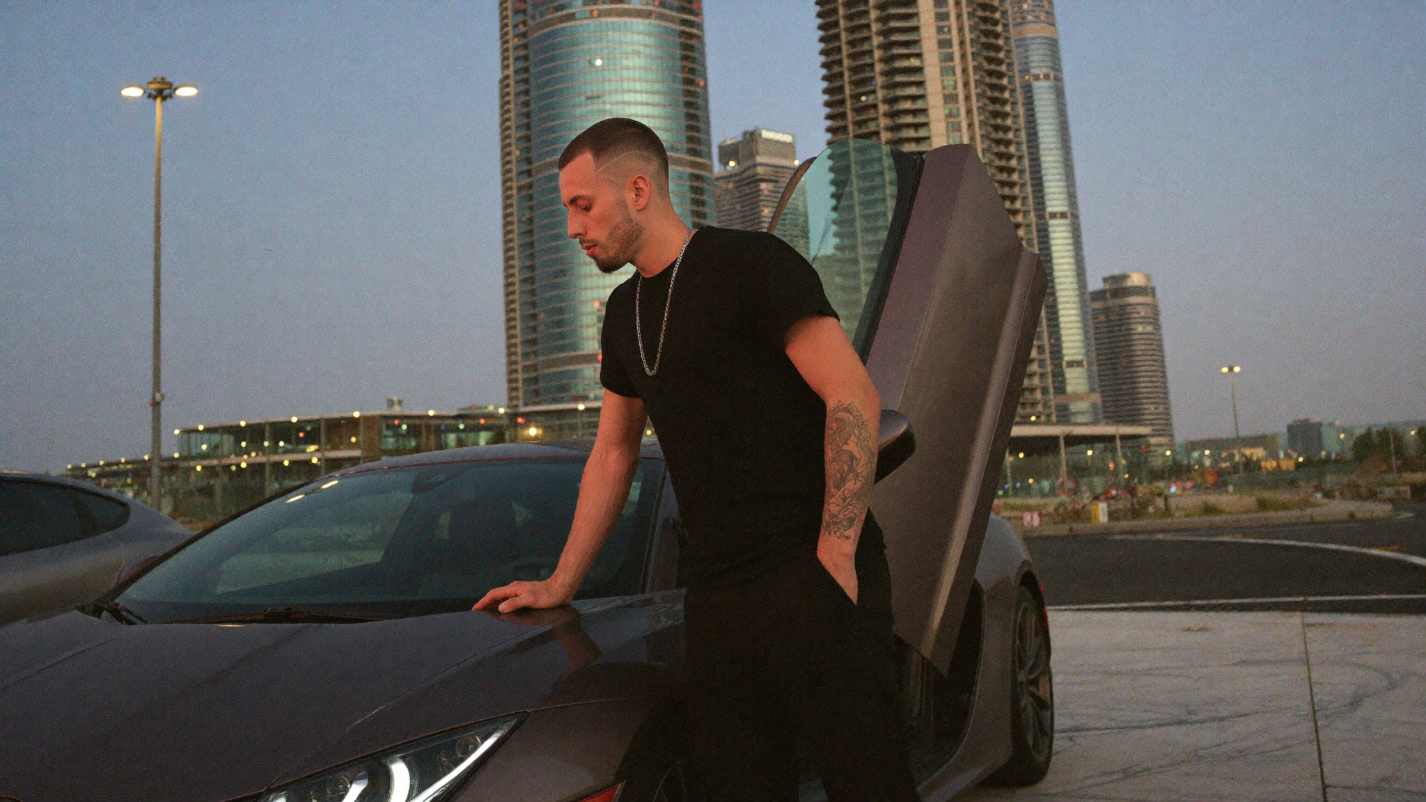
Automotive and architecture
The low angle and the 35mm are deliberate. Wide glass close to a car exaggerates its stance, which is exactly how automotive advertising is shot. Note that the car is described by silhouette rather than named, for reasons covered further down.
Photorealistic editorial lifestyle photograph, [SUBJECT], wearing a fitted black tee, black cargo trousers and a thin silver chain, leaning against the door of a matte grey low wide angular supercar with the scissor door raised, parked on a marble forecourt in front of glass towers in [CITY] at dusk, warm sodium light and cool blue ambient sky, heat haze, candid documentary framing from a low angle, shot on ARRI Alexa 35 with a 35mm lens at f2.8, shallow depth of field, Kodak Vision3 grading with fine film grain, real skin texture with pores, warm natural color, no text, no logos, no brand badges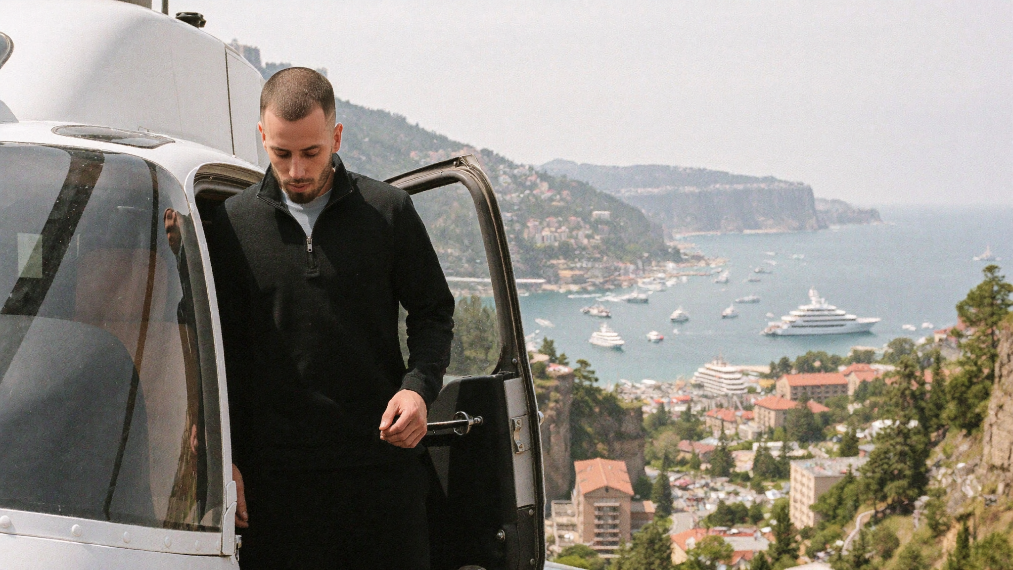
Aviation and elevation
Mid-motion is the trick in this one. “Stepping down from the open door” and “not looking at camera” produce a documentary frame instead of a posed one, which is the single biggest tell separating editorial work from content that looks staged.
Photorealistic editorial lifestyle photograph, [SUBJECT], wearing a charcoal quarter zip and dark trousers, stepping down from the open door of a small white helicopter on a coastal helipad above [CITY], harbour and terracotta rooftops far below in soft haze, bright overcast light with gentle contrast, candid mid-motion moment not looking at camera, shot on ARRI Alexa 35 with a 50mm lens at f2.8, shallow depth of field, Kodak Vision3 grading with fine film grain, real skin texture with pores and asymmetry, natural color, no text, no logosInteriors and property
Directly useful for real estate, short-term rental listings and architectural practices. Medium format at f4 gives the slightly compressed, very even rendering that high-end property photography uses.
Editorial architectural photograph of a minimalist [ROOM] at golden hour, floor to ceiling windows overlooking [VIEW], low travertine coffee table, a single boucle armchair, warm raking sunlight casting long shadows across a wide plank oak floor, one ceramic vase with dried branches, deliberately sparse and uncluttered, shot on medium format with an 80mm lens at f4, natural light only, subtle film grain, muted warm neutral palette of bone, sand and charcoal, no people, no text, no logosProduct and still life
The workhorse for ecommerce and brand launches. Single light source, deep shadow, named materials, macro focal length. Change the object and the rest holds.
Luxury product still life, [OBJECT] with a brushed steel case and a dark grained leather strap resting on a raw stone slab beside a folded linen cloth, single soft window light from the left with a deep falloff into shadow, visible micro texture in the leather and stone, shot on medium format with a 120mm macro lens at f8, shallow depth of field, dark moody neutral palette, editorial catalogue styling, no text, no logos, no brand namesHospitality and resort
Blue hour plus artificial warm light against cool ambient shade is the most reliable “expensive resort” combination there is. Keeping people out of the frame makes it usable across more campaigns.
Editorial travel photograph of a quiet infinity pool terrace at a cliffside resort at blue hour, still water reflecting a deep indigo sky, two empty teak loungers with folded white towels, warm lantern light glowing against cool ambient shade, distant coastline softly out of focus, shot on 35mm with a 50mm lens at f2, natural available light, fine film grain, restrained composition with generous negative space, no people, no text, no logosNegative prompts: what to leave out
Exclusions matter as much as inclusions. These are the ones worth appending to almost every luxury prompt, and why.
- no text, no logos. Generated text is still the most obvious giveaway in an otherwise convincing image. Garbled signage ruins a frame instantly.
- no brand badges. Stops the model inventing a mangled emblem on a car grille or a watch dial.
- no readable text on screen. Essential whenever a laptop or phone is visible.
- never beautified or smoothed. Counteracts the default tendency toward airbrushed plastic skin.
- no CGI, no game engine render. Pushes the output toward photography rather than 3D.
- no clutter. Pairs with an explicit object count to protect your negative space.
Common mistakes
- Adjective stacking. “Luxury, premium, elegant, expensive, high-end, 8k, hyperrealistic, masterpiece” contributes almost nothing. Replace all of it with one camera, one light and three materials.
- Naming real brands. You get warped fake logos and a legal exposure. Describe the silhouette and finish instead.
- Asking for perfection. Flawless skin and perfect symmetry are what make an image read as fake. Ask for pores and asymmetry.
- Overfilling the frame. Every extra object moves the image toward stock photography.
- Changing five things at once. When a generation misses, change one slot and re-run. Otherwise you never learn which slot mattered.
- Relying on a text description for a recurring face. It will drift. Use a trained likeness model if the same person needs to appear repeatedly.
- Forgetting aspect ratio. Generating square and cropping to 16:9 wastes resolution and ruins composition. Set it at generation time.
Trademarks, disclosure and where this crosses a line
Two practical constraints worth being deliberate about, because most prompt guides skip both.
Do not put real brands in your prompts
Beyond the mangled-logo problem, generating imagery that appears to depict a specific manufacturer’s product, and then using it commercially, is a trademark question you do not want. Describing the object by form, material and finish gets you the same visual result without the exposure. Every automotive and product prompt above is written this way on purpose.
Be honest about what the image is
There is a real difference between using generated imagery as art direction and using it as evidence. A synthetic hero image on a landing page, a generated product environment, a mood-setting editorial shot: all normal, all fine. A generated image presented as documentation of something that happened, a place you stayed, or a result a client got, is a different thing entirely, and it is the fastest way to lose the trust that premium positioning depends on.
Ad platforms are also tightening synthetic media disclosure requirements, and several jurisdictions now have rules in progress. If you are running generated creative in paid campaigns, check the current policy of the platform you are running on rather than assuming last year’s rules still apply. The practical test we use: would you be comfortable if a prospect knew exactly how the image was made? If not, it is doing work that only a real photograph should do.
Generated imagery is a production tool, not a substitute for proof. It belongs alongside real work, not in place of it. If you want the design side handled properly, our design packages cover brand imagery and art direction, and the branding packages cover the identity system that all of this has to sit inside.
Frequently asked questions
What is the best prompt structure for luxury AI images?
Eight slots in a fixed order: image type, subject, wardrobe or materials, action, location, light, camera, then grade and negatives. Keeping the order fixed lets you change one variable at a time and learn what actually moved the result, which is what turns prompting into a repeatable system instead of a slot machine.
Why do my AI images look cheap or fake?
Usually three causes together: flat undirected light, no camera or focal length specified, and no grain or skin texture. Add a single directional light source, name a body and lens with an aperture, and explicitly request film grain plus real skin texture with pores and asymmetry. That combination fixes most of it before you change anything else.
Can I put real brand names in image prompts?
You can, but it is a bad idea twice over. Models render brand marks poorly, so you get warped fake logos that undermine the image. And commercial use of imagery depicting a specific brand’s product raises trademark questions. Describe the object by silhouette, material and finish instead, which produces a cleaner image anyway.
How do I keep the same person across multiple images?
Not through prompting. Text descriptions of a face drift between generations, and small features shift every run. Consistency requires a trained likeness model built from a set of reference photos, after which you drop the facial description from the prompt entirely and keep only wardrobe, action, location, light and camera.
Do I need to disclose AI-generated images in marketing?
It depends on the platform and where you operate, and requirements are actively changing, so check the current policy of any ad platform you run on rather than relying on general guidance. As a working rule, generated imagery used as art direction is uncontroversial, while generated imagery presented as documentation or proof of a real event, place or client result is not, regardless of what disclosure rules technically require.
The bottom line
Premium AI imagery is a photography brief, not a wish list. Specify the light, name the lens, list the materials, cap the object count, and ask for the imperfections that real cameras produce. Change one slot at a time. That is the entire method, and it works across interiors, product, automotive, travel and portraiture without modification.
If you would rather have the brand imagery, art direction and the site it lives on handled as one system, look at our design packages, or tell us what you are building through the intake form and we will scope it against what you actually need rather than what fills a gallery.