
A website feels premium when four systems agree with each other: a disciplined type scale, consistent spacing, restrained color, and fast load times. That is the whole secret. It has almost nothing to do with animations or expensive stock photos. This guide breaks down the exact mechanics we apply at Wise Media, with the numbers, so you can audit your own site today.
Summary
- “Premium feel” is measurable: it comes from typographic hierarchy, a spacing system, color restraint, motion discipline, and sub-2-second loads.
- Most cheap-feeling sites fail on consistency, not creativity. Twelve font sizes and random padding read as amateur instantly.
- You can retrofit most of these mechanics onto an existing WordPress or Elementor site without a rebuild.
- In Canada, a professionally designed premium site typically runs $3,500–$15,000+; the mechanics below are what that money should be buying.

Table of Contents
- What makes a website feel premium?
- Why do most small business websites feel cheap?
- Typography: the hierarchy system
- Spacing: the 8-point discipline
- Color and restraint
- Motion and micro-interactions
- Speed: premium is fast
- Imagery and copy that carry their weight
- What does a premium website cost in Canada?
- The premium-feel checklist
- Common mistakes
- FAQ
What Makes a Website Feel Premium?
A premium website is one where every visual decision follows a consistent system: one type scale, one spacing unit, one restrained palette, and interactions that respond instantly. Visitors can’t name these systems, but they feel their presence as “expensive” and their absence as “off.” Consistency, not decoration, is the signal.
Think about the sites everyone points to when they ask for that premium startup feel: Apple, Stripe, Linear. Strip away the brands and look at the mechanics. Enormous headlines with tight line height. Paragraphs that never stretch wider than about 70 characters. Space between sections that feels almost wasteful. Two colors doing the work most sites assign to six. Buttons that respond in under 100 milliseconds. None of that is taste. All of it is repeatable.
That’s good news if you run a business, because it means premium is a checklist, not a gift. We apply the same system whether we’re building for a realtor, a short-term rental brand, or a SaaS founder, and it produces the same effect every time.
Why Do Most Small Business Websites Feel Cheap?
Cheap-feeling websites almost always share the same five defects: too many font sizes, inconsistent spacing, too many colors, stock photos that scream stock, and slow loads. Each one individually is minor. Stacked together, they read as “nobody with standards looked at this,” and visitors transfer that judgment directly onto your business.
Here’s the part that surprises people: the fix is usually subtraction. When we audit a site that feels off, we’re rarely adding things. We’re deleting font sizes, merging near-duplicate colors, cutting section dividers, and removing animation. A typical small business homepage we inherit has 10 to 14 distinct font sizes. A premium one needs about six.
The other common cause is template drift. The site launched on a decent theme three years ago, then five different people added sections, plugins, and banners. Every addition made a locally reasonable choice with globally inconsistent results. This is why templates age badly and why choosing a design partner who enforces a system matters more than the initial mockup.
Typography: The Hierarchy System
Typography carries roughly 80% of the premium signal because text is 80% of most pages. Get three things right: a modular scale, disciplined line height, and real hierarchy between levels.
Use a modular type scale
Pick a base size (16px or 18px for body) and a ratio (1.25 to 1.333 works for most business sites), and derive every size from it. A practical six-size system: 16px body, 20px lead paragraph, 25px H3, 31px H2, 39px H1 on mobile, scaling to 60–80px hero headlines on desktop. Nothing outside the scale, ever. The moment you eyeball a size, drift begins.
Line height and measure
- Body text: line height 1.5 to 1.7, line length 55–75 characters. Wider than that and reading fatigue reads as “cheap.”
- Headlines: line height 1.05 to 1.2, with slight negative letter spacing (-0.01em to -0.03em) on anything above 32px. This one change makes headlines look designed.
- Never justify text on the web. Ragged right edges read cleaner at every screen size.
Font pairing without the agony
One family, multiple weights, beats two mediocre families. Inter, Söhne-style grotesks, or a good system stack cover 90% of business sites. If you pair, pair contrast: a sharp grotesk for headings with a quiet serif for editorial body, not two similar sans-serifs fighting for the same job. And load a maximum of two font files with font-display: swap, because typography that flashes in late undoes its own polish.
Spacing: The 8-Point Discipline
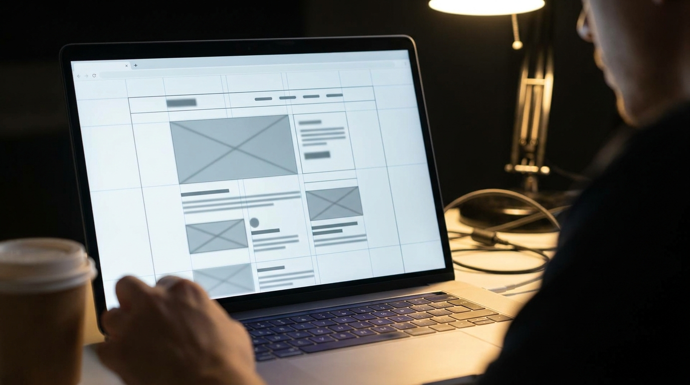
Premium sites use a spacing scale the way music uses a time signature. Base everything on 8px multiples: 8, 16, 24, 32, 48, 64, 96, 128. Related elements sit close (8–16px), unrelated sections sit far apart (96–128px on desktop). The contrast between tight and generous is what creates rhythm, and rhythm is what visitors experience as calm.
The most common spacing failure is uniform padding: every gap on the page set to roughly 20–30px. Uniform spacing destroys grouping, so the eye can’t tell which caption belongs to which image, and the whole page feels like a bulletin board. Fix proximity first. It costs nothing.
Then get comfortable with white space that feels excessive. Apple leaves 120–160px between homepage sections. Your instinct will say that’s wasted screen. Your visitors’ instinct will say this company is confident. In Elementor terms: set section padding to 96px top and bottom on desktop, 64px on mobile, and stop letting individual widgets carry their own random margins.
Color and Restraint
A premium palette is one dominant neutral, one text color, and one accent. That’s it for 95% of the page. The accent appears on primary buttons, links, and maybe one highlight per screen, which is exactly why it works: scarcity gives it authority. Sites that use their brand color on every heading, icon, and divider train visitors to ignore it.
- Never use pure black on pure white. Use near-black (#111–#1a1a1a) on off-white, or near-white on rich dark. Pure contrast reads harsh and dated.
- Check contrast ratios: 4.5:1 minimum for body text. Accessible contrast and premium feel point the same direction.
- Shadows: large blur, low opacity (something like 0 20px 40px at 8% opacity). Tight dark shadows are the fastest way to look like 2012.
- Borders: either a hairline at 10–15% opacity or none. Heavy 1px solid #ccc boxes around everything is bulletin-board energy again.
Motion and Micro-Interactions
Motion should confirm, not perform. The premium standard in 2026 is subtle and fast: hover states that respond in 150–250ms with an ease-out curve, cards that lift 2–4px, buttons that darken slightly. One scroll-triggered fade per section at most, moving no more than 20–30px, animating opacity and transform only.
What kills the premium feel: parallax everything, elements flying in from left and right, counters that animate every time you scroll past, and carousels that auto-rotate. Every one of those was a premium signal at some point. All of them are now template signals. When in doubt, delete the animation and keep the hover state.
Speed: Premium Is Fast
No site feels premium at four seconds. Speed is the first premium signal a visitor receives, before a single design decision registers. Target: Largest Contentful Paint under 2 seconds on mobile, and instant response to every tap and hover.
The practical WordPress recipe: decent Canadian or edge hosting, one caching plugin doing its job, WebP images sized to their containers, two font files maximum, and a hard audit of plugins (most sites we inherit can lose a third of them). We covered the full process in our guide to website speed optimization for Canadian businesses, including what actually moves Core Web Vitals versus what just moves your PageSpeed score.
Imagery and Copy That Carry Their Weight
One real photo of your team, your space, or your work beats ten polished stock images. Visitors have seen every smiling-headset stock photo in existence, and their brains filter them as wallpaper. If you must use stock or AI-generated imagery, art-direct it: consistent lighting, consistent color grade, no literal metaphors (handshakes, lightbulbs, arrows going up).
Copy is a design element too. Premium sites write short. Four-word headlines. One-sentence paragraphs near CTAs. Numbers instead of adjectives (“47 sites launched” beats “many happy clients”). If your homepage headline is 20 words long, no type scale can save it. Say one thing per screen and let the spacing frame it.
What Does a Premium Website Cost in Canada?
In Canada in 2026, a professionally designed business website with the mechanics above typically costs $3,500 to $8,000 for a small business build, and $8,000 to $25,000+ for larger sites with custom systems, e-commerce, or integrations. DIY on a template runs $500 to $1,500 in tools and time but almost always fails the consistency test without a design system behind it.
| Approach | Typical cost (CAD) | Gets you the mechanics? |
|---|---|---|
| DIY template (Elementor/Divi) | $500–$1,500 | Only with serious discipline; drift is the default |
| Freelancer | $1,500–$5,000 | Depends entirely on whether they work from a system |
| Agency build | $3,500–$15,000+ | Yes, if they can show you their type and spacing scales |
| Custom design system + build | $10,000–$25,000+ | Yes, plus consistency survives future edits |
The honest test when comparing quotes: ask to see the type scale and spacing system behind a portfolio piece. Anyone selling premium should be able to show you the system in two minutes. Full market pricing is in our 2026 Canadian website pricing guide, and our own tiers are on the website packages page. If the brand itself needs work before the site can feel premium, that’s a branding conversation first, because no spacing scale fixes a weak logo and voice.
The Premium-Feel Checklist
- Count your font sizes. More than 7? Consolidate to a modular scale.
- Body text at 16–18px, line height 1.5–1.7, max 75 characters per line.
- Negative letter spacing on all headlines above 32px.
- Every margin and padding on an 8px multiple; section padding 96px desktop / 64px mobile.
- One accent color, used only on actions and links.
- Near-black on off-white, never pure black on pure white.
- Soft large shadows or none; hairline borders or none.
- Hover states everywhere, 150–250ms, ease-out.
- Delete every animation that moves more than 30px.
- LCP under 2 seconds mobile; two font files max; WebP images.
- Replace your three worst stock photos with real ones.
- Cut homepage headline to under 8 words.
Common Mistakes
- Adding instead of subtracting. Premium is a deletion exercise. More sections, badges, and effects always move you away from it.
- Copying a premium site’s colors instead of its systems. Painting your template in Stripe’s palette changes nothing. The spacing and type discipline is the product.
- Redesigning without fixing speed. A beautiful site at 4 seconds still feels cheap. Speed first, polish second.
- Letting future edits break the system. Document the scale, or six months of “quick updates” will erode everything you paid for.
- Treating mobile as the shrunken version. Over 60% of your visitors judge premium on a phone. Design the mobile spacing and type scale deliberately, not as a byproduct.
FAQ
How do you give a website that premium startup feel?
Apply four systems consistently: a modular type scale with tight headline line height, an 8px spacing scale with generous section gaps, one accent color reserved for actions, and sub-2-second load times. Then subtract: fewer fonts, fewer colors, fewer animations, shorter copy. The startup feel is discipline, not decoration.
Can I make my existing WordPress site feel premium without a rebuild?
Usually, yes. Consolidating font sizes, enforcing an 8px spacing scale, reducing the palette, and fixing speed are all retrofittable in Elementor or the block editor. A rebuild is only necessary when the theme fights you on every change or the underlying structure is bloated beyond saving.
Does a premium-feeling website actually convert better?
Yes, because the same mechanics that read as premium also reduce friction: clear hierarchy tells visitors where to look, fast loads keep them on the page, and restrained CTAs concentrate attention on one action. Design credibility also directly affects whether visitors trust you enough to submit a form or call.
What’s the single highest-impact change if I only do one thing?
Fix spacing. Put every gap on an 8px multiple, tighten related elements, and double the space between sections. It requires no new assets, no developer, and no budget, and it produces the largest visible jump in perceived quality of any single change.
Conclusion
Premium is not a talent you hire so much as a system you enforce: one type scale, one spacing unit, one accent, fast loads, and the discipline to delete everything else. Audit your site against the checklist above and you’ll find most of the gap is free to close. The rest is where a design partner earns their fee.
If you’d rather have the system built for you, we design and build premium websites for Canadian businesses every week. Tell us about your project through our intake form and we’ll come back with a scoped recommendation and exact pricing.