AI travel photos fail for reasons that have nothing to do with the person in them. Famous landmarks bring crowds, repeating architecture, harsh midday light and signage, and those four things are precisely where image models break. Fix the location problems and the person takes care of itself.
Every image in this article is AI generated. I have not been to any of these places. Each frame was chosen because it demonstrates one of the specific principles below, and the full seven-wonders test run is documented in the shot list further down.
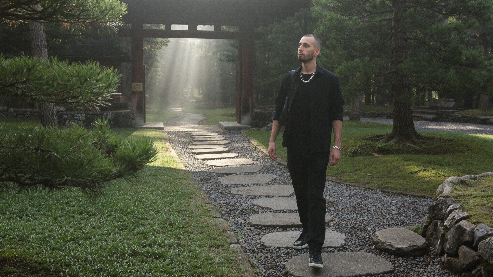
Summary
- Crowds are the number one tell. Background tourists render with melted faces and merged bodies. Shoot at dawn and forbid them outright.
- Repeating architecture drifts. Arches, columns and steps fall out of alignment. Compose so they are partly obscured or out of focus.
- Landmark as context beats landmark as subject. The postcard angle is the hardest to render and the least interesting to look at.
- Tourist sites are covered in text. Signage, plaques and tickets attract garbled lettering. Name every surface and forbid it.
- A set must read as one trip. Vary shot type deliberately, and check identity drift across the whole set rather than frame by frame.
- Detail shots are the highest-yield frames because they contain no face to get wrong.
- Never imply you were there. Likeness rules are one thing, place claims are another, and this is the one that gets people caught.
This article assumes you already have the basics of prompting a consistent character. If you do not, start with how to make AI photos of yourself that do not look AI, then come back for the location-specific problems.
Table of Contents
- Why landmark photos fail differently
- The crowd problem, and the dawn fix
- Landmark as subject versus landmark as context
- The repeating architecture problem
- Text is everywhere at tourist sites
- Building a shot list that reads as one trip
- The seven wonders, frame by frame
- Checking a set instead of a photo
- The honesty line: place claims are not likeness claims
- Common mistakes
- The bottom line
Why Landmark Photos Fail Differently
A portrait in a cafe has one hard problem: the face. A photograph at the Colosseum has five, and the face is the easiest of them.
Famous places are difficult for image models for reasons that are structural rather than stylistic. They are crowded, so the frame fills with secondary humans that the model renders far worse than the primary one. They are architecturally repetitive, and repetition is where geometry drifts. They are usually photographed at the worst possible time of day, so the training data is full of flat midday snapshots. And they are covered in text, from entrance signage to information plaques to the ticket in your hand.
None of that gets fixed by better prompting of the subject. It gets fixed by choosing a photograph where those problems are not in the frame. That is a compositional decision, and it is the same decision a real travel photographer makes, for almost the same reasons.
The Crowd Problem, and the Dawn Fix
Background people are the single most reliable giveaway in AI travel imagery. The model gives full attention to your primary subject and treats everyone else as texture, so you get figures with four legs, faces that smear, two people sharing a torso, and heads duplicated across a crowd line. At a busy site, that is most of your frame.
The fix is to remove the crowd from the scene rather than from the render. Specify dawn or first light, state that the site is empty at that hour, and add background crowds to your negatives. Three instructions, all reinforcing each other.
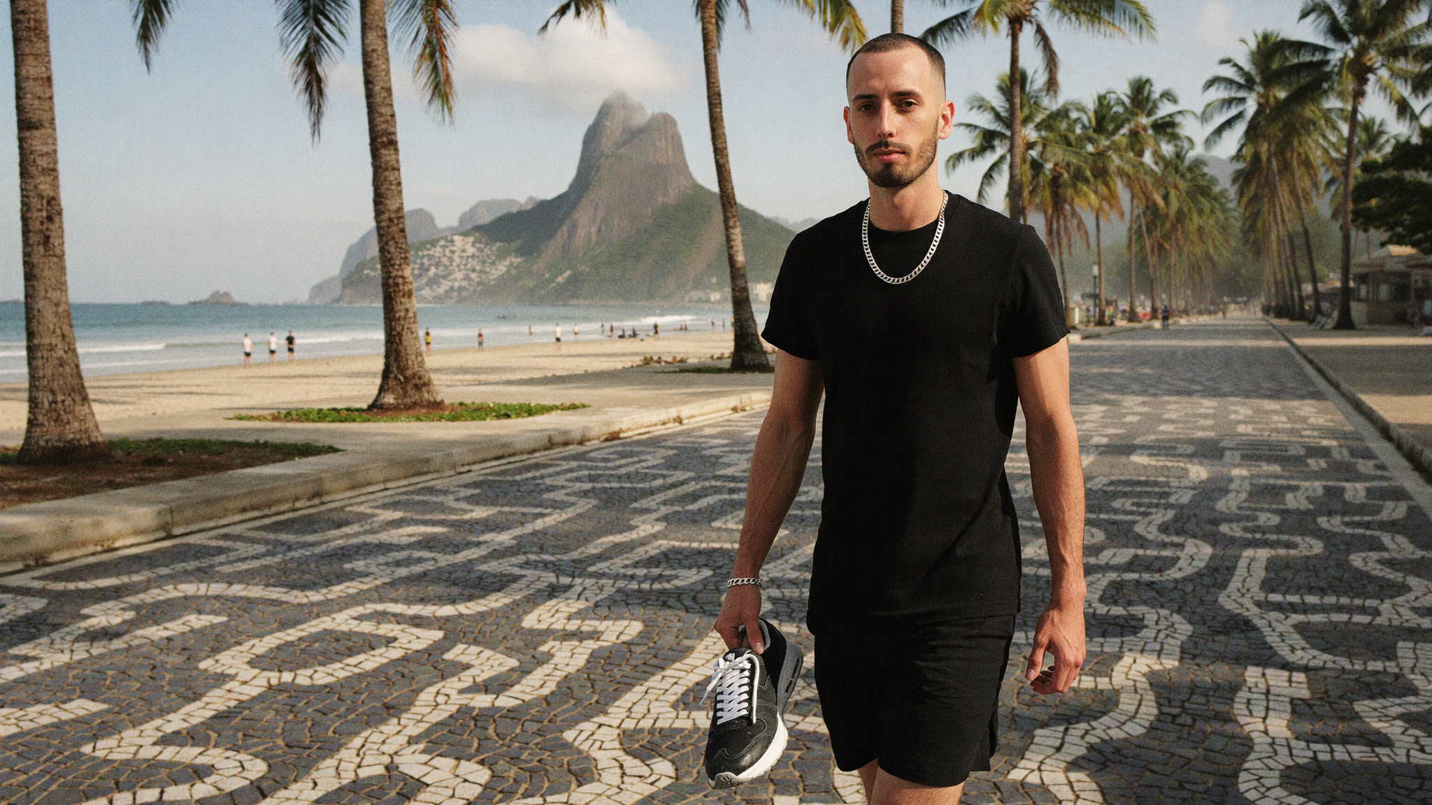
What makes this work is that it is not a cheat. Empty landmarks at sunrise are exactly what travel photographers get up at four in the morning to shoot. A deserted Taj Mahal at dawn is plausible in a way that a deserted Taj Mahal at two in the afternoon is not. You are choosing a real photographic strategy that happens to route around the model’s weakest capability.
Blue hour and just after closing work the same way. So does bad weather, which additionally gives you wet ground, reflections and a reason for the light to be soft.
Landmark as Subject Versus Landmark as Context
The instinct is to put the monument dead centre behind the person, filling the frame. This is the worst available choice. It is the angle with the most training-data contamination from tourist snapshots, it puts maximum pressure on the model to render the architecture correctly, and it produces an image that looks like every other photo of that place.
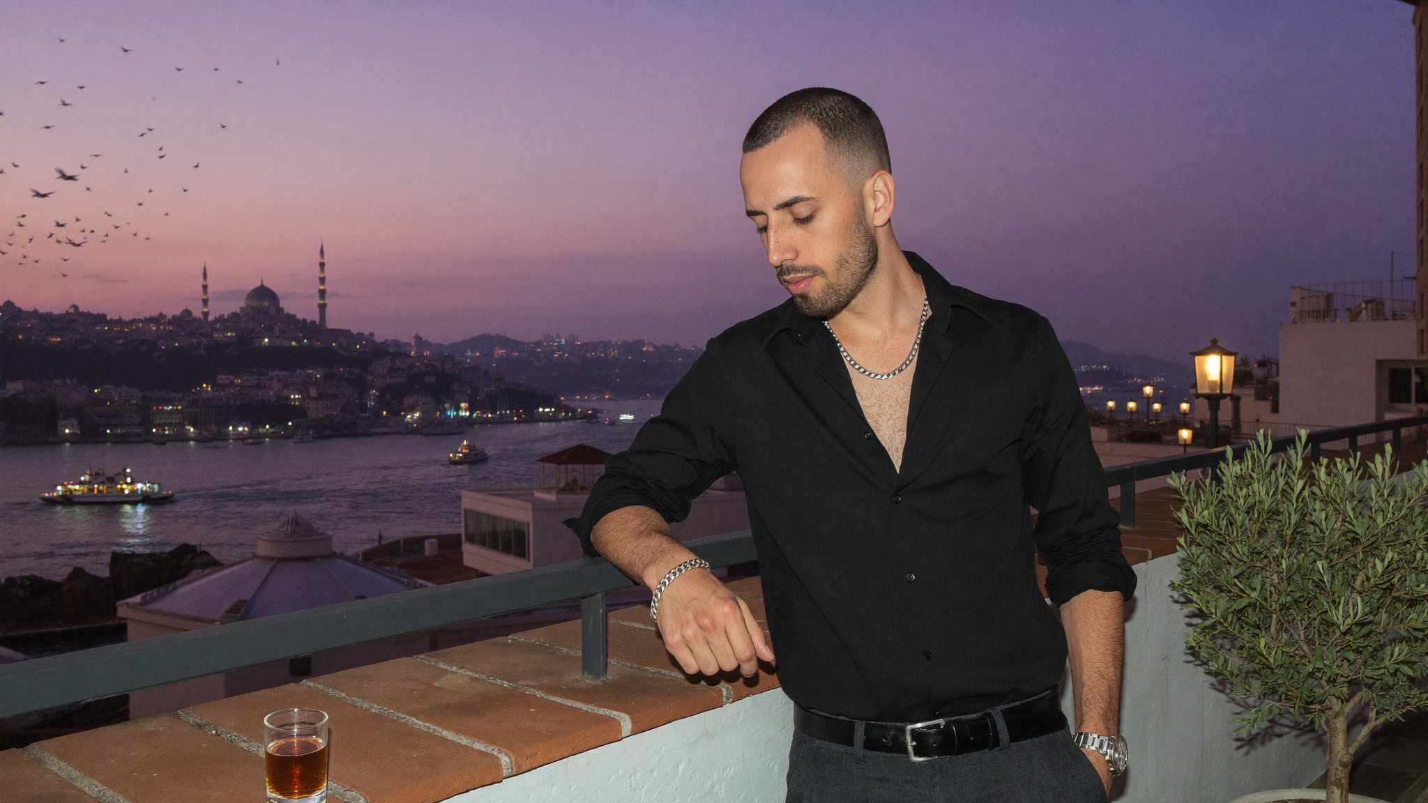
Better options, roughly in order of how well they render:
- The landmark small and distant. A statue read across a valley is both easier to render and more interesting than the same statue looming overhead. Distance also lets atmospheric haze do useful work.
- Inside looking out. A watchtower doorway gives you a hard shaft of light, a blown highlight, a black interior, and only a small amount of architecture to get right.
- Detail at the surface. Fingertips on inlaid marble. No wide architecture, no crowds, no face.
- Back to camera. Solves the face and turns the person into a compositional element rather than a portrait subject.
- Off-axis. Approach the site from the side or from behind rather than from the postcard viewpoint.
There is a specific trap with figurative monuments. Rendering a famous statue’s face at close range tends to go wrong in the uncanny direction, and it is very noticeable because the viewer knows what it should look like. Keep it distant, keep it partial, or keep it out of frame above the top edge.
The Repeating Architecture Problem
Arcades, colonnades, terraces and staircases are structurally repetitive, and models lose count. You get arches that change size along a row, columns that do not sit on a common baseline, stairs that stop being parallel, and windows that drift out of their grid. On unfamiliar architecture a viewer might not notice. On the Colosseum they will.
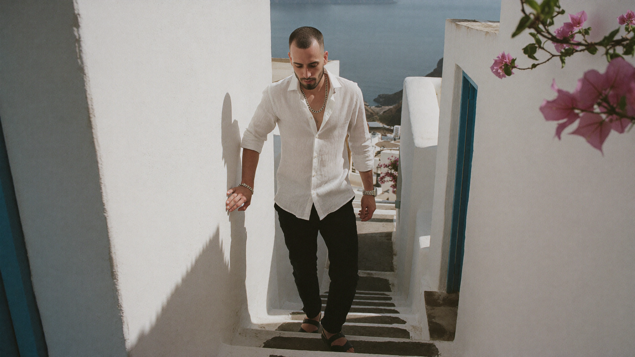
Three things that help:
- Let the repetition fall out of focus. If the colonnade behind you is at f/2.8 and eight metres back, the model has far less to get right.
- Break the run. Compose so a foreground element interrupts the row rather than showing twenty uninterrupted arches.
- Use raking light. Hard directional light throwing strong shadow bars across a structure reads as convincing depth and hides small geometric inconsistencies inside the contrast.
Add distorted architecture to your negative block as a matter of routine. It will not fix a bad composition, but it measurably reduces the softer failures.
Text Is Everywhere at Tourist Sites
Image models still cannot render small text reliably. What comes out is pseudo-lettering: shapes that look like characters until you focus on them. At a heritage site the potential surfaces are everywhere. Entrance signage, interpretive plaques, wayfinding arrows, ticket stubs, water bottle labels, the map in your hands, the dial of your watch.
Handle it in two moves. First, name the specific surfaces in your scene that could attract lettering and forbid text on each of them by name. A generic “no text” is weaker than “no readable text on the map, the bottle label or the watch dial”. Second, if a prop exists only to carry a brand or a word, cut the prop. A folded map with no legible writing still reads as a map because of how paper bends and how hands hold it.
The same applies to logos on clothing. If a brand mark keeps rendering as mush, drop it and carry the brand through silhouette, fabric and colour. A believable photograph beats a forced logo every time.
Building a Shot List That Reads as One Trip
A set of seven images has a failure mode a single image does not: it can look like seven separate photoshoots. Real travel sets have rhythm. Wide establishing frames, medium candid moments, tight details, a couple of frames where the person is barely in it.
Plan the variety before generating anything. Assign each location a shot type and a lens, and make sure no two adjacent frames share both. Keep wardrobe logic consistent with climate, so the mountain frames carry technical layers and the tropical frames carry linen, while the palette stays constant across all of them.
Here is the actual list I ran across the seven modern wonders, two frames each.
| Location | Shot type | Lens and aperture | Problem it routes around |
|---|---|---|---|
| Great Wall of China | Wide, walking uphill at first light | 28mm at f/5.6 | Empty at dawn, long shadows prove a real sun position |
| Great Wall watchtower | Tight, thermos in a doorway | 85mm at f/2 | Almost no architecture in frame, blown doorway, black interior |
| Petra | In the Siq shadow, facade in sun | 35mm at f/4 | Bounced light as the key source, carved detail kept at distance |
| Petra ledge | Seated with a folded map | 50mm at f/2.5 | Hands given a job, background thrown well out of focus |
| Christ the Redeemer | Back to camera at the platform rail | 35mm at f/5.6 | Statue out of frame above, avoids rendering its face |
| Rio overlook | Seated profile, statue small across the valley | 50mm at f/2.8 | Landmark as context, haze covers the distance |
| Machu Picchu | Crouched, retying a boot | 35mm at f/4 | Unposed body language, flat overcast light |
| Machu Picchu ridge | Tiny figure, ruins far below | 28mm at f/8 | Person dwarfed by place, terraces too distant to drift visibly |
| Chichen Itza | Walking away across the plaza | 35mm at f/6.3 | One pyramid face lit and one in shade, no crowd |
| Chichen Itza colonnade | In shade, plaza blown out behind | 50mm at f/2.8 | Columns fall out of focus, sweat and heat as realism cues |
| Colosseum exterior | Blue hour, wet cobblestones | 50mm at f/2.8 | Mixed colour temperature, arches softened by aperture |
| Colosseum interior | At the barrier above the hypogeum | 50mm at f/2.8 | Hard light bars through arches hide geometric drift |
| Taj Mahal | Walking the reflecting pool at dawn | 35mm at f/5.6 | Symmetry is simple geometry, mist hides the treeline |
| Taj Mahal detail | Fingertips on the inlaid marble | 85mm at f/2.2 | No face, no crowd, no wide architecture |
Read down the right-hand column and the pattern is obvious. Almost every frame is designed around something the model is bad at. That is the actual skill. Not writing more adjectives, but choosing photographs whose difficulty sits inside the model’s competence.
The Seven Wonders, Frame by Frame
A few location-specific notes worth stealing.
Great Wall of China
The wall climbing a ridge gives you a natural leading line and a reason for the subject to be mid-stride rather than posed. Dawn from behind the ridge rims the shoulders and throws long shadows down the steps toward camera, which is the cheapest possible way to prove the sun is in a specific place.
Petra
The best light here is not direct. Standing in the shade of the Siq with the sunlit facade ahead means the key source is warm light bouncing off sandstone, which is genuinely how that scene works in life. Specify the bounce as the dominant source and let the gorge walls behind fall to unfilled shadow.
Machu Picchu
Flat overcast is usually a weakness. Here it is accurate, since the site is famously cloud-wrapped, and it removes the burden of tracking shadow direction across complex terraces.
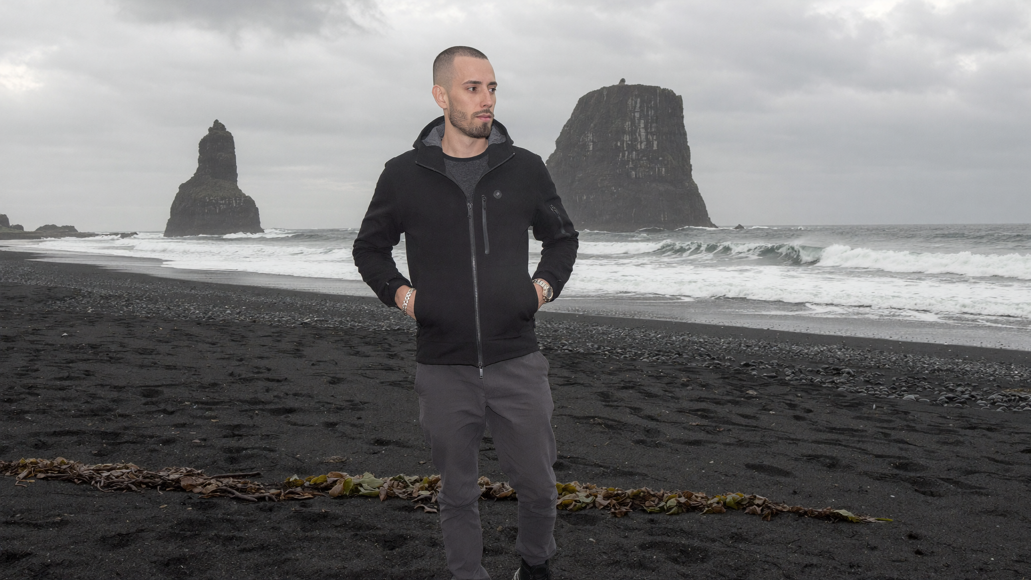
Colosseum
Blue hour with warm floodlights on the stone gives you two colour temperatures in one frame, which is difficult to fake and instantly reads as real when it lands. Wet cobbles bounce warm light upward.
Taj Mahal
White marble against a monochrome wardrobe is a clean, controlled palette. The reflecting pool is simple bilateral symmetry, which is much easier for a model than an irregular facade. River mist behind the dome conveniently removes the entire background.
Checking a Set Instead of a Photo
Run the usual per-frame artifact check first: fingers and their contact points, watch cases and bracelets, invented lettering, bent architecture, shadows that disagree with the stated light source, background figures, plastic skin.
Then do the check most people skip. Put every frame side by side at the same size and look only at identity. Jaw width, hairline, the distance between the eyes, how heavy the brow reads. Individually each frame will pass. Together, drift is glaring, and a set where the person subtly changes between locations is worse than no set at all, because it triggers suspicion without the viewer knowing why.
Budget for a real reject rate. Roughly one keeper in four is normal, and a seven-location set is exactly where that bites, because you need every location to land rather than just your favourite one. Generate extras at the locations that matter most and select for likeness rather than for scenery.
The Honesty Line: Place Claims Are Not Likeness Claims
Most guidance on AI image ethics covers likeness and consent, which matters and is well trodden. Travel imagery raises a separate issue that gets far less attention: the claim that you were somewhere.
Generating your own face is your business. Generating your own face at Machu Picchu and letting people believe you went is a factual claim about your life, and it is the kind of claim that unravels badly. It is trivially disprovable, it tends to surface at the worst possible moment, and for anyone selling expertise or credibility it does damage out of all proportion to the value of the photo.
The distinction that holds up in practice:
| Reasonable | Not reasonable |
|---|---|
| Illustrating an article about a place or a technique | Posting it as a travel update from that place |
| Concept and campaign mockups | Case study or testimonial imagery |
| Aspirational brand styling, clearly stylised | Manufactured evidence of experience or credentials |
| Your own likeness, or someone’s with written permission | A recognisable public figure, or anyone who did not agree |
| Labelled synthetic imagery | Passing synthetic imagery off as documentary |
A useful test: if the use case collapses the moment you disclose it, the problem is the use case, not the disclosure. Several major platforms now label synthetic media automatically regardless of what you declare, so the practical odds of quietly getting away with it keep getting worse. Check the current rules where you publish, because this area is moving fast.
Common Mistakes
- Shooting the postcard angle. Maximum difficulty, minimum originality.
- Leaving the crowd in. Every background person is a chance to fail.
- Midday sun by default. Flat light, harsh shadows, peak crowds, worst training data.
- Rendering famous faces. Statues and monuments with figurative detail go uncanny fast.
- Forgetting local text. Plaques, signage and tickets are all lettering traps.
- Wardrobe that ignores climate. Linen on a cold ridge breaks the set instantly.
- Seven versions of the same shot. No rhythm, and it reads as a template.
- Checking frames individually. Identity drift only shows up side by side.
The Bottom Line
Putting yourself at a famous landmark convincingly is not a prompting problem, it is a photography problem. Choose the hour that empties the site. Choose the angle that keeps difficult geometry out of the frame or out of focus. Give the light a physical source and let part of the picture fall into shadow. Name every surface that could sprout text. Vary the shot types so the set has rhythm. Then check the whole set for identity before you check any single frame.
Do that and you get travel imagery nobody else has. Skip it and you get the same averaged postcard everyone else is generating, with four-legged tourists in the background.
If you want to invent locations rather than use real ones, the same logic applies with fewer constraints. We covered that in wild AI photo prompts.
Frequently Asked Questions
Why do AI photos at famous landmarks look worse than AI photos in a cafe?
Because landmarks add four problems a cafe does not have: crowds of secondary people, repeating architecture that drifts out of alignment, signage and plaques that attract garbled text, and a training set dominated by flat midday tourist snapshots. The person is usually the part that renders correctly. It is everything around them that fails.
How do you stop AI from generating deformed people in the background?
Design them out of the scene rather than trying to fix them. Specify an hour when the location would genuinely be empty, state in the prompt that the site is deserted at that time, and add background crowds to your negative list. If a scene truly needs other people, keep them very distant and very out of focus so there is no facial detail to get wrong.
Is it legal to generate AI photos of yourself at real places?
Generating your own likeness is generally the least risky case, since you are the person whose rights are involved. The risk moves from the image to how it is used. Presenting it as documentary evidence, as a travel claim, or as proof of an experience creates exposure that a labelled illustration does not, and rules on synthetic media disclosure vary by platform and jurisdiction. This is general information rather than legal advice, so check the specific rules that apply to you.
How many generations does a seven-location set take?
Plan on roughly four attempts per keeper, so a seven-image set realistically means somewhere in the region of thirty generations if you want a strong frame at every location. Detail shots and back-to-camera frames land more often than portraits, so weighting your shot list toward those raises the hit rate considerably.
Build the Visual System, Not Just the Photos
A trained character, a locked palette and a reusable prompt structure turn one-off images into a brand image library you can draw on indefinitely. We build those, along with the identity and the site they live on. Start with design packages or branding packages, see the full build in our website packages, or browse all services. When you are ready, tell us what you are building.