Choose brand colours on evidence you can check, not on colour psychology. Pick a palette that is distinctive inside your category, passes contrast requirements, reproduces reliably on screen and in print, and holds up in real layouts. Blue does not make people trust you. A legible, distinctive, consistently applied palette does far more work than any chart mapping hues to emotions.
Summary
- Colour psychology charts are folklore. Specific hue-to-emotion mappings are culturally learned and context dependent, and the findings marketers cite are mixed at best.
- Colour still matters enormously, just not for the reason you were told. It drives recognition, legibility and category appropriateness.
- Distinctiveness beats meaning. The useful question is not what your colour says, it is whether anyone else in your category owns it.
- Most of a working palette is neutrals. A base, an ink, two or three greys, then one or two accents used sparingly.
- Contrast is a hard requirement. WCAG asks for 4.5:1 for normal text and 3:1 for large text. Most brand colours fail that against white.
- Specify colour physically, not by vibe. Hex and sRGB for screen, CMYK or a spot ink for print, a thread or vinyl reference for physical.
- Test in context. A palette that looks good on a moodboard routinely falls apart in a real interface, on a sign, or next to a photograph.
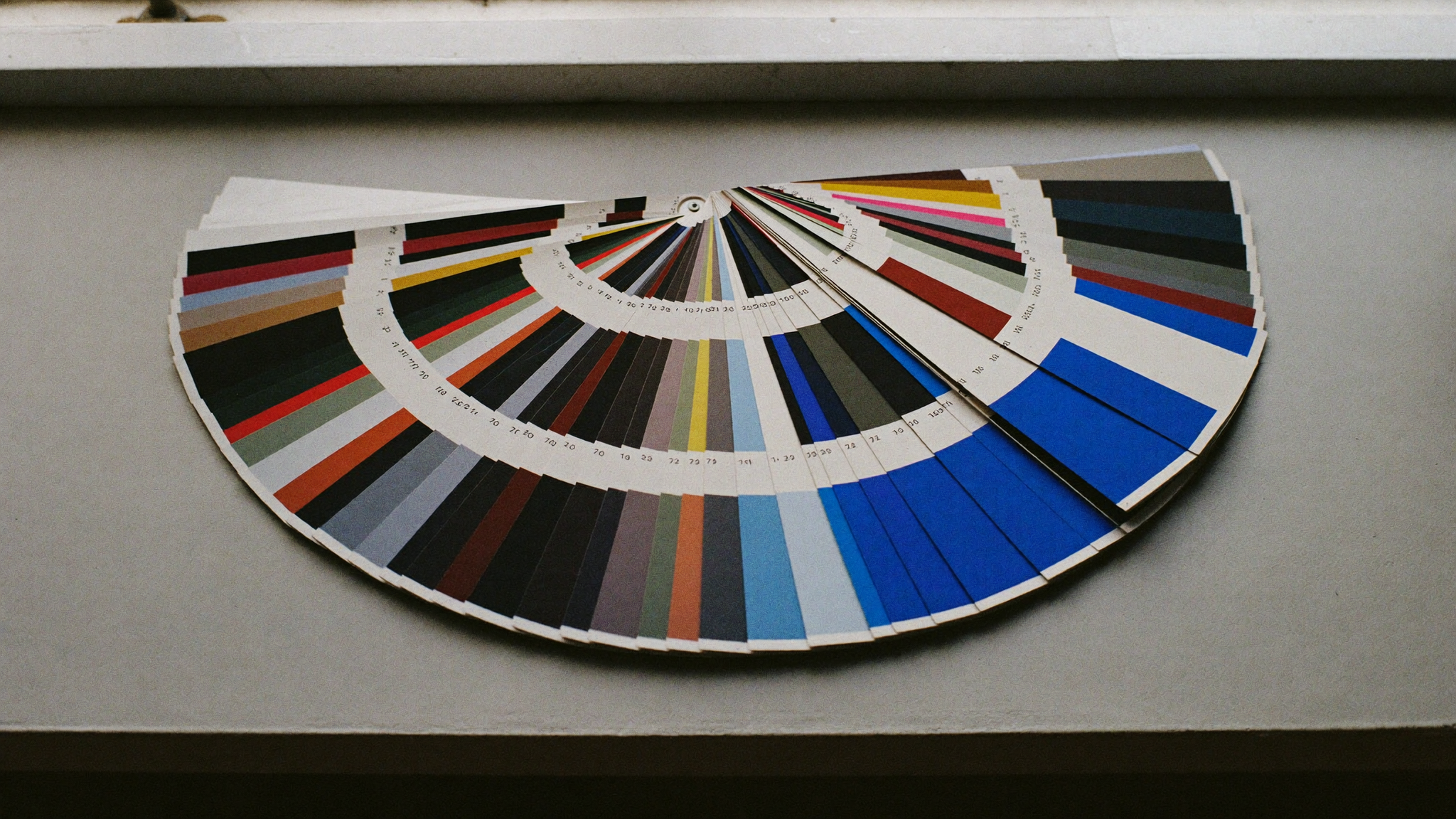
Table of Contents
- Why colour psychology is mostly folklore
- What colour actually does for a brand
- Step one: find distinctiveness inside your category
- Step two: build a palette structure, not a mood
- Step three: check contrast and accessibility
- Step four: specify reproduction across every medium
- Step five: test in context, not on a moodboard
- Common mistakes when choosing brand colours
- The bottom line
- Frequently asked questions
Why colour psychology is mostly folklore
The version of colour psychology that circulates in marketing decks is not a science. It is a set of assertions that got repeated until they sounded settled. Blue equals trust. Red equals urgency. Green equals growth. Yellow equals optimism. Every one of those claims is presented as if it were a property of the wavelength rather than a habit of a particular audience in a particular era.
The academic picture is much messier than the infographic. Research on colour and emotion exists, but the findings are inconsistent across studies, sensitive to how the question is asked, and heavily influenced by the sample. Effects that show up in one population often shrink or reverse in another. Most of the studies that do find something are measuring preference or arousal in a lab, not purchase intent toward a brand in a crowded market.
The claims, and what actually holds up
| The common claim | What survives scrutiny |
|---|---|
| Blue signals trust and security | Blue dominates finance, insurance and enterprise software. That makes it a signal of category conformity, not of trustworthiness. Convention and familiarity are doing the work. |
| Red creates urgency and lifts clicks | Red buttons often win split tests because they contrast sharply with the page around them. Change the page and the winner changes. The variable is salience, not the hue. |
| Green means nature, health and growth | Green reads as environmental in some markets and as currency, luck or something unrelated in others. The association is learned, and it is not stable across cultures. |
| Yellow makes people feel optimistic | Yellow is unusually visible against most backgrounds, which is why it is used for warnings and wayfinding. Visibility is not the same thing as mood. |
| Black is inherently luxurious | Luxury converged on black because restraint photographs well and high contrast reproduces cleanly. It is a category convention that became self reinforcing. |
| Pink is feminine | A Western convention roughly a century old, and one that ran the other way in earlier periods. If a meaning can flip within living memory, it is not innate. |
Meaning is contextual, not chemical
White is the colour of weddings in much of the West and of mourning in parts of East Asia. Red is danger on a dashboard, celebration at a Chinese New Year, and a discount tag in a supermarket, and the same person reads all three correctly without confusion. That is the whole problem with the mapping model. Colour meaning is decoded from context, and context changes faster than any brand guideline.
Even inside one culture, the surrounding design does most of the interpretive work. A deep red on a heavy serif wordmark, letterpressed on uncoated stock, reads as heritage. The same red on a rounded sans in a sticky banner reads as a clearance sale. Nothing about the pigment changed. The typography, material, spacing and copy changed, and those carried the meaning.
None of this means colour is irrelevant. It means the effect you are chasing lives in appropriateness and recognition, not in a private emotional channel between a wavelength and a customer.
What colour actually does for a brand
Colour does three jobs reliably. Every practical decision in this article comes back to one of them.
1. Recognition
This is the big one. A consistent colour applied across every touchpoint becomes a shortcut to your name. People identify brands from a cropped fragment of packaging, a delivery van at a distance, or a strip of colour at the top of an app, long before they read a word. That is a memory structure you build through repetition, not a meaning you inherit from the hue.
Recognition is also the reason changing your colours casually is expensive. You are not swapping an aesthetic, you are resetting an asset that took years of exposure to build.
2. Legibility
Colour determines whether people can read you at all. Contrast between text and background is measurable, it is regulated in a growing number of jurisdictions, and it is the single most common way a beautiful palette becomes a liability. A brand colour that cannot carry body text is not a failure of the brand, it is a fact about the colour that you plan around.
3. Appropriateness
Audiences carry expectations about what a category looks like. Neon gradients on a wealth management firm create friction, not because purple means anything, but because it violates a learned pattern for that category. Appropriateness is real and worth respecting, and it is also the thing you deliberately break when your strategy is to look like nothing else on the shelf. Either move is valid. Doing it by accident is not.
Step one: find distinctiveness inside your category
The first question is not what your colour means. It is who already owns it in the rooms where you compete. Distinctiveness is the only property of a brand colour that translates directly into commercial value, because it is what lets someone identify you without reading.
Run a category audit before you pick anything. It takes an afternoon and it kills most bad ideas early.
- List the ten to fifteen brands your buyer actually sees. Not your aspirational peer set. The competitors in the search results, the shelf, the directory or the feed where the decision happens.
- Screenshot each one and pull the dominant colour. Homepage hero, logo, primary button. Sample the actual pixel values instead of trusting your memory of them.
- Lay them out as a single strip. Nine times out of ten you will see a cluster. Legal is navy. Wellness is sage and off white. Fintech is a blue to violet gradient. STR and hospitality is warm neutral with a photo.
- Find the gap that is still credible. You are looking for a position that is unoccupied but not absurd for the category.
- Squint at it from across the room. If your candidate disappears into the cluster at two metres, it will disappear in a search results page too.
The gap is rarely an exotic hue. More often it is a difference in value or saturation. A category full of mid blues can be beaten by a much darker one. A category of saturated brights can be beaten by near black with a single restrained accent. Distinctiveness is relative, so you only need to be different from the specific set of brands you are compared against.
This audit belongs at the same stage as your name and your positioning, before anyone opens a design file. If you are still at that stage, our branding packages run the audit, the palette and the identity system as one piece of work, and it is worth reading our guide to naming a business in Canada first, since name clearance and visual distinctiveness are the same problem wearing different clothes.
Step two: build a palette structure, not a mood
Amateur palettes are five colours of roughly equal weight, arranged in a neat row. Professional palettes are mostly neutral, with one or two accents that are used rarely enough to still mean something. The row of five swatches is a presentation artefact. It is not how the palette gets used.
Think in roles rather than favourites. Every colour in the system should have a job description, and anything without one gets cut.
| Role | What it does | Rough share of a layout |
|---|---|---|
| Base | The dominant surface. Usually white, off white or near black. | 60 to 70 percent |
| Ink | Body text and primary type. Needs to be high contrast against the base first and pretty second. | Most of the readable area |
| Supporting neutrals | Two or three greys for borders, dividers, disabled states, secondary text and section backgrounds. | 20 to 30 percent |
| Primary accent | The brand colour. Buttons, links, key highlights, the thing people remember. | 5 to 10 percent |
| Secondary accent | Optional. Charts, illustration, a second tier of emphasis. Many brands do not need one. | Under 5 percent |
| Functional colours | Success, warning, error, information. Chosen for clarity and convention, not brand fit. | As needed, never decorative |
Wise Media runs on that structure. Near black, near white, and a single blue accent. Three values doing the work that most brands try to get from seven. The discipline is not minimalism for its own sake, it is that a rare colour stays loud. Use the accent on every second element and it stops signalling anything at all.
Build tints and shades, not more colours
Once you have an accent, you need variants of it, not siblings for it. A hover state, a pressed state, a tinted background, a version dark enough to sit as text on white. Generate those from the same hue by adjusting lightness and saturation, and lock them into the system with names rather than raw values. When a developer writes a colour token instead of a hex code, your palette survives its first redesign.
Dark mode is part of this, not an afterthought. A colour that reads well on white frequently glares on a near black surface, and pure white text on pure black causes visible halation for many readers. Plan a paired set from the beginning. Retrofitting one later is how brands end up with two palettes that do not agree.
Step three: check contrast and accessibility
This is the step that turns colour selection from taste into engineering. The Web Content Accessibility Guidelines set published, measurable thresholds, and they are the closest thing to an objective test your palette will ever face.
| What you are colouring | Minimum contrast ratio (WCAG 2.1 Level AA) |
|---|---|
| Normal body text | 4.5:1 against its background |
| Large text, meaning 18pt and up, or 14pt and up when bold | 3:1 |
| User interface components and graphical objects, such as input borders, icons and focus indicators | 3:1 |
| Body text at Level AAA | 7:1 |
| Large text at Level AAA | 4.5:1 |
| Purely decorative elements and disabled controls | No minimum, though legibility still matters |
Why your brand colour usually cannot carry body text
Most brand colours are chosen for vibrancy, and vibrancy is the enemy of contrast. Saturated mid tone blues, greens, oranges and teals commonly land somewhere around 3:1 against white. That is comfortably enough for a heading or a button fill, and it is not enough for a paragraph. Brands hit this wall constantly, then either ignore it or repaint the entire identity in a panic.
The fix is boring and it works. Keep the brand colour where it belongs, on fills, large type, icons and highlights, and create a darker text variant of the same hue for anything set at reading size. The two read as one colour to the audience and as two very different numbers to a contrast checker. You keep the identity and you keep the readability.
The other habit worth building early: never carry meaning in colour alone. A red field border, a green status dot or a colour coded chart is invisible to a reader with a colour vision deficiency, which affects a meaningful share of men in particular. Pair every colour signal with a label, an icon, a pattern or a position.
This is no longer only a design preference in Canada. Accessibility requirements now sit in provincial and federal law, and contrast is one of the first things an audit flags. We covered the obligations and the practical remediation path in our guide to website accessibility compliance in Canada, and the short version is that choosing your palette with a contrast checker open is dramatically cheaper than fixing it after a complaint.

Step four: specify reproduction across every medium
A hex code is a description of light. A printed sheet is a description of ink on a surface. They are different physical systems, and a colour that exists comfortably in one may not exist at all in the other. This is where most palettes quietly break.
Screens emit light and mix colour additively, so they can produce intensely saturated brights, particularly in the blue to green range. Print reflects light and mixes subtractively, so those same brights flatten out. Take a vivid screen teal to a four colour process press and it comes back duller and slightly shifted, every time. Nobody made a mistake. The colour was outside what the process can reproduce.
The professional move is to test the colour in its hardest medium before you commit, not after. If the brand will live on printed packaging, a vehicle wrap or an embroidered shirt, decide there first and let the screen version follow.
| Medium | How you specify it | What tends to go wrong |
|---|---|---|
| Screen, web and app | Hex and sRGB, with tokens rather than loose values | Uncalibrated monitors and dark mode surfaces change the apparent colour |
| Digital and offset print | CMYK build, or a spot ink where consistency matters | Saturated brights go dull, and the same build looks different on coated and uncoated stock |
| Spot and premium print | A named ink reference, checked against a current physical guide | Guides fade with age and light exposure, so an old book gives you the wrong target |
| Signage and vehicle wrap | A vinyl film reference, viewed outdoors at scale | Colour reads differently at size, in daylight, and after UV exposure |
| Apparel and embroidery | A thread reference, plus a fabric colour it must sit on | Thread ranges are limited, and dye lots shift between production runs |
| Powder coat, ceramic, product finishes | A manufacturer finish code and a physical sample | Gloss level changes perceived colour more than most people expect |
Two rules follow from all of this. First, specify a colour physically wherever you can, with a swatch someone can hold, not with an adjective. Warm charcoal is a conversation. A named ink on a specific stock is an instruction. Second, write down what happens when the exact colour is impossible, because eventually a supplier will tell you it is. Decide in advance whether they match to the nearest available reference or fall back to the neutral.
Your brand guidelines should carry every one of these values in one document, alongside the single colour, reversed and greyscale versions of the logo. If that document does not exist yet, it belongs in the same scope as the identity work. Our design packages cover the production specification, not just the pretty pages.
Step five: test in context, not on a moodboard
A moodboard is the most flattering possible environment for a colour. Large clean blocks, generous white space, no interface, no photography, no copy, no competitor next to it. Every palette looks good there. That is exactly why the moodboard tells you nothing.
Test the palette where it has to survive.
- In a real layout. A full homepage with actual copy length, a navigation bar, three button states and a form. Not a hero section on its own.
- At real size, on a real device. Colour looks different on a phone held at arms length in daylight than it does on a large calibrated display in a dim room.
- Against your own photography. Brand colours fight images constantly. If your visual style is warm documentary photography, a cool accent will argue with every single frame.
- In dark mode and in light mode. Both, from day one.
- At small size. A favicon, an app icon, a social avatar, a logo embroidered on a chest. Subtle colour distinctions vanish below a certain scale.
- In greyscale. If two palette colours collapse into the same grey, they were never doing separate jobs.
- Through a colour blindness simulator. Red and green pairings are the usual casualty.
- Printed, and pinned to a wall. Then walk away and look at it from across the room, next to the competitors you audited in step one.
The distance test is the one people skip and the one that decides most arguments. Colour decisions made at a screen from forty centimetres away are made at the wrong distance for how the brand will actually be encountered.

Common mistakes when choosing brand colours
- Starting from a psychology chart. You end up with the same navy as everyone else in your category and a rationale that cannot be tested.
- Picking the colour before the strategy. Distinctiveness is defined relative to competitors. If you have not decided who you are compared against, you cannot know whether your colour is distinctive.
- Choosing five equally weighted colours. Without a dominant base and a rare accent, nothing has hierarchy and every layout looks unresolved.
- Ignoring contrast until the build. Discovering at development that your brand colour fails at reading size is a redesign, not a tweak.
- Using colour as the only signal. Colour coded states, charts and form errors that carry no label exclude readers and fail audits.
- Specifying by vibe. Warm stone, muted sage and dusty terracotta are not specifications. Two suppliers will produce two different results and both will be defensible.
- Approving colour only on screen. If the brand touches print, signage or apparel, the screen is the least demanding medium you will use.
- Forgetting dark mode. Half the audience may never see your light palette at all.
- Chasing the palette trend of the moment. Trend cycles are shorter than brand memory. A colour scheme that dates the brand to a specific year costs you more than a conservative one ever would.
- Changing the accent whenever the team gets bored. Recognition compounds through repetition. Resetting it every eighteen months means you never earn the asset.

The bottom line
Colour psychology promises that the right hue will make people feel a specific way about your business. It does not deliver, because meaning is learned, contextual and unstable across cultures, and the effects marketers point to are usually explained by contrast and convention rather than any innate emotional trigger.
What colour reliably does is more useful anyway. It makes you recognisable, it makes you readable, and it places you correctly inside or deliberately outside a category. Those three outcomes are all testable. You can audit distinctiveness, you can measure contrast, you can check reproduction against a physical swatch, and you can look at the result at real size in a real layout.
Choose the colours that pass those tests, then apply them consistently for long enough that people start recognising you without reading. The palette that wins is almost never the cleverest one. It is the disciplined one that nobody had to change.
Frequently Asked Questions
Does colour really affect conversion rates?
Colour affects conversion through visibility, not emotion. When a red button beats a green one in a test, the usual explanation is that red stood out more against that particular page. Run the same test on a page with a red background and the result frequently flips. So yes, colour choices move numbers, but the lever is contrast and prominence within the specific layout, which means results do not transfer between sites. Test on your own page rather than copying someone else’s winner.
How many colours should a brand have?
Fewer than you think. A base, an ink, two or three supporting neutrals, one accent, and a second accent only if a real use case demands it. Add functional colours for success, warning and error states in any product interface. That is a complete system for most businesses. Large organisations run bigger palettes because they have many sub brands and product lines to separate, which is a different problem from being memorable.
Can I use my brand colour for body text?
Usually not, and that is normal. Most brand colours are saturated mid tones that land near 3:1 against white, which is enough for large headings and button fills but short of the 4.5:1 that normal text requires. The standard solution is a darker variant of the same hue reserved for text, while the original stays on fills, links, icons and large type. The audience reads it as one brand colour. Your contrast checker reads it as two values, both passing.
Do I need Pantone or spot colours?
Only if physical consistency matters commercially. A brand printing packaging across multiple suppliers benefits from a named spot ink, because it gives everyone one target to match. A business whose brand lives on a website, a few decks and occasional digital print does not need the expense. Specify a solid CMYK build and a current physical reference instead, and keep a printed proof on file so you have something to compare against.
Should I choose colours before or after the logo?
Design the mark in black and white first. A logo that only works because of a gradient is a weak mark, and you will need single colour, reversed and greyscale versions anyway for stamps, embroidery, invoices and partner listings. Once the form holds up in monochrome, introduce colour as a layer on top of a structure that already works.
Get a palette built on evidence, not folklore
If your colours were picked from a mood or inherited from a template, a category audit and a contrast pass will tell you quickly whether they are working. See what a full identity build includes across our services and our branding packages, then start a project through our intake form and we will look at your category, your palette and your production specs together.